When I first started managing projects, I used to think every problem had a clear and obvious solution. If a deployment failed, it was probably the code. If a team was behind schedule, they were likely just overcommitted. But the more projects I managed, the more I realized how rarely the root cause of a problem is what we assume it to be at first glance. That’s when I discovered the real value of the Cause and Effect Diagram in Project Management. Since then, it’s become one of my go-to tools when things go sideways and I need clarity fast.

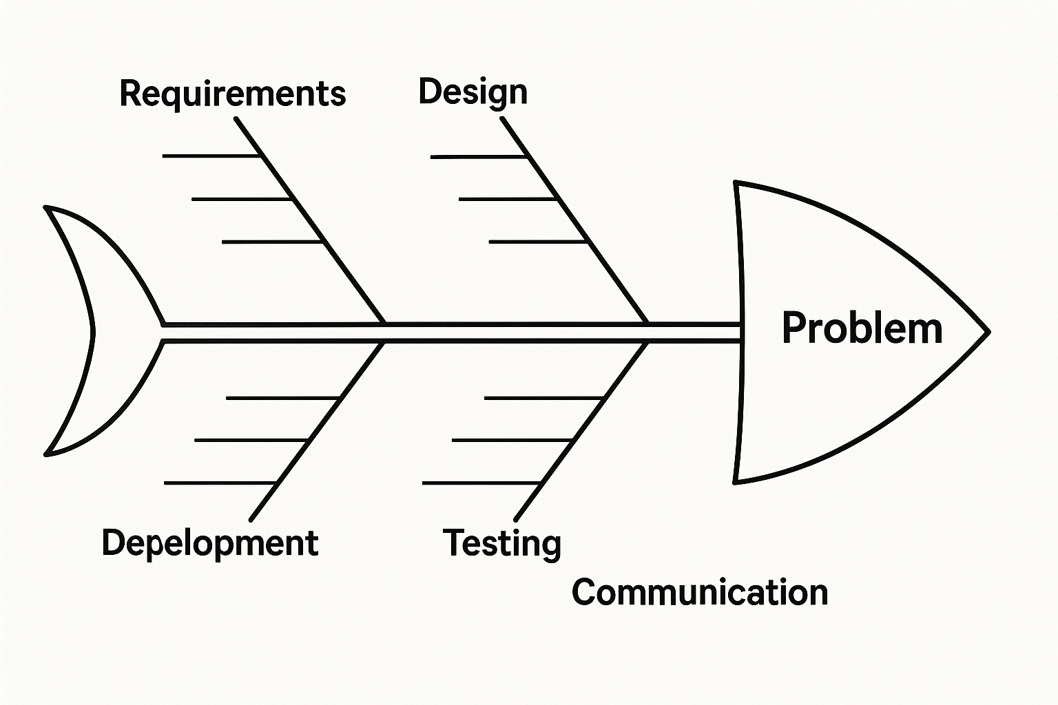
The Cause and Effect Diagram is deceptively simple in structure. It looks like a fish skeleton, with the “head” representing the problem and the “bones” branching off to show potential categories of causes. But despite its simplicity, it’s one of the most powerful tools for uncovering the root causes of issues especially in complex environments like IT, software development, or operations. When used well, it forces you to slow down and really examine the systems and conditions that produce the outcomes you’re seeing, not just react to the symptoms. View Plans and Pricing
I typically use this diagram at two critical moments in a project: when something has gone wrong and we’re in troubleshooting mode, and when we’re proactively trying to de-risk a process or milestone. Let’s say we missed a sprint goal. At first, everyone assumes it’s a capacity issue of too much work, not enough time. But when we take a step back and map out the potential causes using a Cause and Effect Diagram, we often find other contributing factors. Maybe requirements were unclear. Maybe there was a last-minute priority shift. Maybe testing uncovered unexpected technical debt. By mapping out all the contributing causes—under categories like People, Process, Tools, and Environment, we’re able to move beyond finger-pointing and into problem-solving.
The way I approach it is pretty straightforward. First, we define the effect. This is the problem or undesirable outcome we’re trying to analyze. We write it at the head of the diagram. Then we start drawing the “bones”, the major categories that might influence the effect. In an IT setting, these usually include categories like Requirements, Design, Development, Testing, Deployment, and Communication. Once we have those categories sketched out, we brainstorm within each one. What in the development process could have contributed to the issue? Were there delays in code reviews? Was there a mismatch between the estimate and the actual effort? What about the testing side did we miss edge cases because of time constraints or tooling limitations?
What I love about this process is how it brings people together. When we do this as a team, it creates a shared understanding of the issue that’s often missing in more reactive or top-down problem-solving approaches. Everyone gets a voice, and we often uncover causes that wouldn’t have come up in a traditional post-mortem or status update. It’s not about assigning blame…it’s about visibility. And once the causes are mapped out, we can start grouping and prioritizing them. What are the root causes that we can address immediately? Which ones are systemic and might require broader process changes?
One of the most eye-opening moments I’ve had using this technique was during a recurring defect issue in a web application we were supporting. It seemed like every time we released a new version, the same bug reappeared, despite being marked as resolved in the backlog. The immediate assumption was that QA wasn’t catching it. But after running a Cause and Effect Diagram with the whole team, we found that the root cause was buried in our deployment process. A secondary server was caching old components and reintroducing the bug with every deployment. Without the diagram, we probably would’ve kept cycling through the same conversations about testing coverage and user error. Instead, we fixed the process and closed the loop for good.
Beyond firefighting, Cause and Effect Diagrams are also incredibly useful during project planning. When I’m building a risk register or helping a team identify failure points ahead of a release, this technique helps us think proactively. Instead of waiting for issues to surface, we preemptively explore what could go wrong and why. It’s essentially applied critical thinking with a visual format that’s easy for stakeholders at any level to follow.
That’s another reason I continue to use this tool. It scales. Whether I’m working with a dev team, business stakeholders, or an executive steering committee, the structure of the diagram makes it easy to communicate the logic behind our decisions. I’ve used it to justify requests for additional resources, to push back on unrealistic deadlines, and to align cross-functional teams around a shared understanding of risk. When people can see the cause-effect chain mapped out clearly, they’re far more likely to support the necessary changes.
In the end, project management is about navigating uncertainty. We don’t always have the luxury of time or perfect information, but we do have tools that help us make smarter decisions with what we’ve got. The Cause and Effect Diagram in Project Management is one of those tools. It helps us pause, think clearly, and focus on the true drivers behind the problems we face—not just their symptoms. Whether you’re in the middle of a crisis or planning your next release, I encourage you to try it. Draw the fish. Trace the bones. You might be surprised at what you discover.
